
Key Takeaways on a Revenue Cycle Dashboard
- A revenue cycle dashboard gives you real-time visibility into billing performance, cash flow, denials, and accounts receivable.
- A KPI dashboard turns revenue cycle data into action by showing where to focus follow-up, fix workflows, and improve collections.
- Leading indicators keep you ahead of month-end surprises by tracking trends mid-month and course-correcting before revenue drops.
- Core RCM metrics reveal where money gets stuck by monitoring days in AR, clean claim rate, charge lag, and point-of-service collections.
- Analytics tools strengthen reporting consistency by automating calculations, enabling drill-down detail, and supporting faster decision-making.
Healthcare revenue cycle management (RCM) is no small task. Constantly changing requirements, regulations, and complex processes make it laborious and error prone. But you have to make revenue cycle management second only to patient care to survive. In this article, we share why a healthcare revenue cycle dashboard is key to financial health. We also share tips on what to monitor to help make RCM most effective.
What Is a Healthcare Revenue Cycle Dashboard?
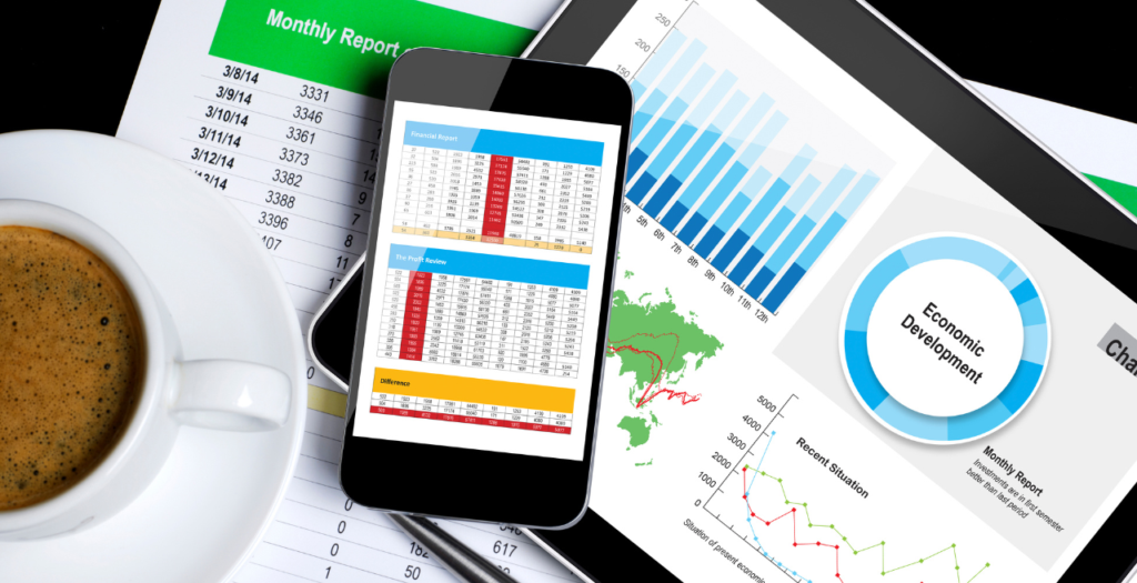
A healthcare revenue cycle dashboard, or revenue cycle KPI dashboard, is a visual picture or snapshot. Hospitals, clinics, and medical practices can use it to monitor, analyze, and optimize operational and financial performance. It tracks and analyzes the daily transactions along with the flow of money from patient services through revenue collection and beyond, including denial and contract management.
The best revenue cycle dashboard provides real-time visibility into medical billing, revenue metrics, and other key measures, such as patient access, booking efficiency, and registration accuracy. Ideally, it works in real-time and combines data from multiple sources (like patient scheduling, electronic health records, billing, claims and accounts receivable management) in one view.
A single view makes it easier for administrators and financial teams to track key performance indicators (KPIs) across the entire revenue cycle. That visibility lets you see where things are working well and where you need to make improvements. It also lets you monitor initiatives to make sure improvements are working. And it may even serve as a critical tool for coding and compliance audits.
With a good revenue cycle dashboard, your team can reduce denied claims, stay compliant, and improve financial health for your hospital or practice.
What Your Dashboard Can Tell You
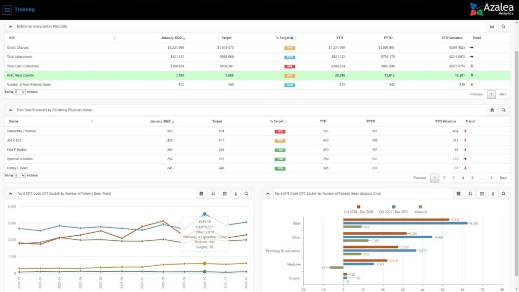
On your revenue cycle KPI dashboard, you can get actionable insights on seasonality, gross charges, claim approval rates, days in accounts receivable (AR), total AR, high denials rates, and payment trends. Having that information can help you track changes in:
- Claim statuses at a glance, so you can focus your team on where to follow up
- Denial rate trends — for example, which codes and procedures are rejected most and why
- Cash flow and where issues are coming from
- Payment trends so you can identify where collections are lagging and need follow up.
- Workflow efficiency
When you can easily see what’s happening and identify patterns, you can have your team take steps to implement fixes. You can also track how effective those fixes are over time and pivot just as easily again if needed.
For example, a denial dashboard lets your team identify patterns and root causes of denied claims. With that information, you can implement targeted solutions and improve reimbursement rates. And tracking the claim appeal rate helps you monitor the percentage of denied claims that have been appealed and overturned, supporting revenue recovery and workflow optimization.
Your dashboard can also let you identify compliance gaps and be audit ready.
What to Make Sure Your Dashboard Calculates
From your dashboard, you want to monitor multiple formulas, including those noted below:
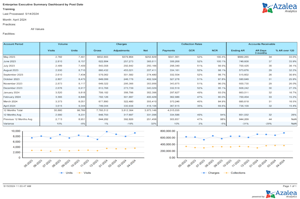
- Days in AR measures how long it takes to collect payments
- Days to pay counts the number of days it takes to collect a payment
- Payment rate, which is your total payments collected divided by gross charges
- Payments per visit, which is payments divided by visit count
- Noncontractual adjustments, which track bad debt and write-off adjustments
- Gross collection rate measures total money received against charges billed to show how effectively you’re securing payments
- POS collection rate tracks the percentage of payments collected directly from patients at the time of service
- Total POS payments can be tracked to optimize payment procedures and financial management by measuring the proportion of payments collected at the point of service
- Collecting payments, including gross collection rate, POS collection rate, and total POS payments lets you evaluate and improve the payment collection process
- Clean claim rate tracks how many claims are clean, which helps you reduce rework and speed up reimbursement
- Charge lag measures how long it takes to bill for a service; shorter charge lags improve cash flow
The best dashboard solution is one that just works. It also includes built-in interactive dashboards and reports with drill through to detail for these and other metrics. You can build dashboards in spreadsheet software if you need. Or, if you outsource RCM billing services, your provider should supply data to you.
Tip! After you build (or access) your initial KPI dashboard, build reports for different providers and different locations if applicable. For example, if you find that days in AR are going up or your average days to bill has spiked, specific reports and dashboards can help you identify if it’s a certain location or provider that’s taking longer to get claims out the door or isn’t coding properly, etc.
Key Performance Indicators to Track in Your RCM Dashboard
You can use an RCM dashboard to track almost any metric. Below are a few to track as a best practice.
Include Leading Indicates on Your Revenue Cycle Dashboard
Leading indicators are one of the least used key performance indicators (KPIs). They’re quantifiable measures you can use to assess financial performance, operational efficiency, and progress toward your goals. And they let you track selected data at certain intervals, which lets you get ahead of your claims, denials, revenue, and more.
If you don’t have some sort of routine indicator, at the end of the month you might run reports or look at your dashboard and find out that you haven’t collected enough money or filed enough claims. You can end up surprised after the fact and scrambling to fix things.
The easiest way to use a leading indicator is to build your dashboard, whether manually or using Azalea Healthcare Analytics or a similar tool, with a “check-in” date in the middle of the month. That check-in date lets you consistently compare the current month to previous months before the month is over. You can calculate variances or forecast future months. With a good tool, you can automate that process instead of doing it manually or building it out in a datasheet program.
Track POS Collections and Claims Benchmarks with Your Dashboard
To keep cash flowing, you want your team to send claims as quickly as they can. You can use your dashboard to help make that happen with three calculations:
- EDI (electronic data interchange) rejection rate
- Average days to bill
- Point of Service collections percentage
With these calculations, you can accurately understand how efficiently your front-end is running. And you can analyze total costs related to collections, including staff, administration, and technology, to identify inefficiencies and optimize expenses
EDI Rejection Rate
Use your analytics tool’s built-on calculation or calculate your EDI rejection rate by taking the total number of front end EDI rejections divided by total claims filed within the given period. A 5 to 10% rate is common. But, whenever you can, keep it below 4%. Your EDI rejection rate shows you how efficient your charge capture and coding are.
Azalea Analytics shows you EDI rejection rate on your dashboard.
Average Days to Bill
If you don’t have automated analytics, to calculate your average days to bill, take the average bill date minus the service date for each new claim filed in a given period. Ten days is the standard, but if you can, keep it below 8 days. Your average will tell you the lag time between your date of service and bill date.
Azalea Analytics automatically calculates your average days to bill.
Point of Service Collections Percentage
Point of service collection measures the percentage using built-in metrics in your dashboard or by taking the sum of patient collections by cash, checks, or credit card posted within 7 days of service and 70% or higher is ideal.
Your point of service percentage shows your front office’s calculation efforts. The end goal is to rely as much as you can on your front-end for cash flow and not your back-end invoicing.
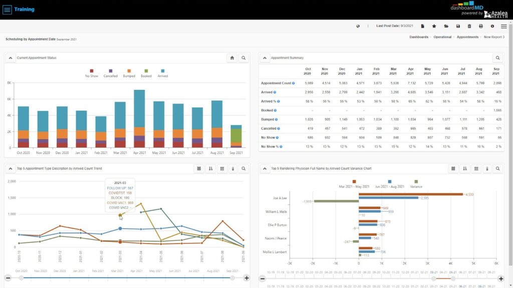
Track Appointment Scheduling Benchmarks
These benchmarks show you how efficiently you’re scheduling along with your provider availability and utilization rates. With the right analytics tool, you can take all of your appointments for a given period of time and break them down by appointment status, such as arrived or no-show, and further by appointment type, provider, payer and even resource. You can see how many patients arrive, how many didn’t show, and how many rescheduled.
In order for this dashboard view to work, staff need to log patient arrival times appropriately, check them in correctly and flag no-shows. Data integrity is paramount. If there’s concern about the validity of the data, this might be a great time to retrain staff on scheduling.
You can use results to reconsider your patient engagement approach. For example, if no-shows are high, implementing automated reminders and immediate rescheduling will help.
And if you’re a growing practice and are trying to figure out how many more patients or providers you could take on or need, you can calculate that with your data. Look at how many business days are available in the month, how many open time slots there are on provider’s schedules, and how many were actually filled.
Monitor Time of Service Collections
If you track patient metrics related to collecting payments, such as total self pay cash and point of service (POS) collection rate, you can see if payments are improving or declining. If you compare this with point of service, you can track how efficient your front end is.
If you want to break down and analyze this data, ask yourself, how you’re determining patient out-of-pocket amounts. How are you asking for payment? Do you need to retrain staff on certain collection processes? Depending on your specialty, as much as 20 to 40% of your collection rate can come directly from patients, and if you don’t have a solid process, it affects your bottom line.
Why Use an Analytics Solution for Your RCM Dashboard
With an analytics solution for your RCM dashboard, you can:
- Get built in indicators/reports
- Analyze cost and profitability by profit centers, monitor contracts under and over payments, cash collections, and investigate new revenue opportunities
- Easily create your own reports by clicking, dragging, and dropping items
- Schedule reporting.
- Access interactive daily dashboards or drill-down views
- Get more than RCM analytics, get clinical analytics, population health, operational excellence, and more
And with access to real-time insights, you can track your KPIs, identify high-risk accounts, and make data-driven decisions to optimize operations.